[one_half]
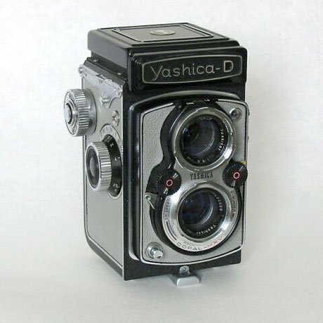
Here is the Rebrand and Identity Package for Gillette Portrait Arts. I initially wanted to bring a focus to the “G” in the name of Gillette, and give it a simple and clean shape as the mark. During my early stages of the process, a design friend of mine pointed out that one of the concepts looked similar to a vintage camera. Since I was designing a logo for a photography company, I mimicked the design/shape of a Yashica-d Vintage Camera. Can’t help but love happy accidents.
Project: Rebrand and Identity Package
Client: Gillette Portrait Arts
3 words to describe this company: Urban, Bohemian, Authentic
[/one_half]
[/one_half_last]

